I didn’t originally have much interest in the free trial for SL Go. I’d been following the news with interest, but I hadn’t considered trying it out until I found myself without a computer that could run SL. Now, while my laptop waits for new parts, I’ve had to resort to using my hub’s aged iMac and it is not a fan of Second Life. I can log in and putter around in my skybox, but even then I have to keep graphics low and my fps is in the low single digits. Exploring is not an option at all, and I was beginning to miss playing virtual tourist. It seemed like a good time to try out the SL Go free trial, both on the desktop and the mobile, and see if it might be a good temporary way to access SL, at least until my laptop is fixed. I was seeing a lot of reviews about how amazing everything looked, so I signed up for the trial with high hopes.
Having now used all of my twenty free minutes, my experience with the trial convinced me that one of these applies: 1) All the people raving about how amazing this is must be using totally different software, or 2) I’m way too picky and hard to please.
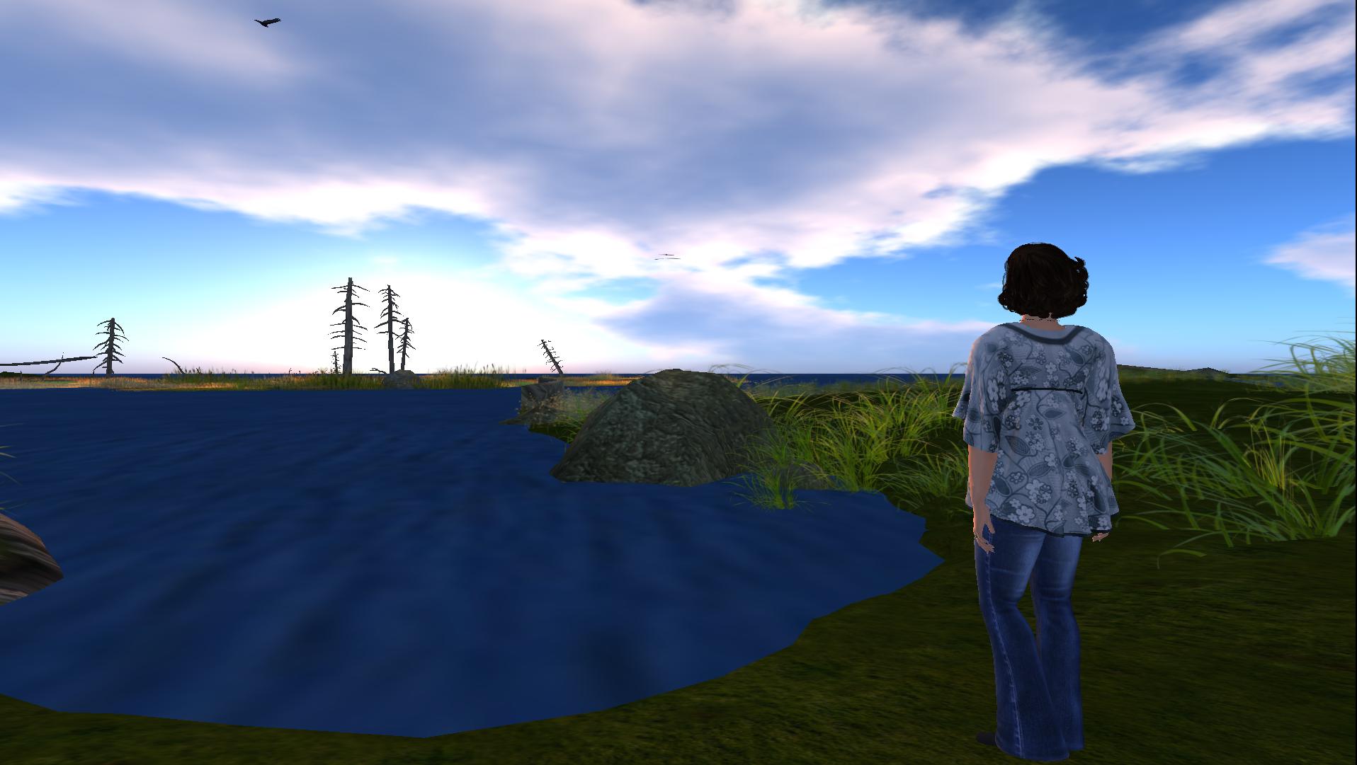
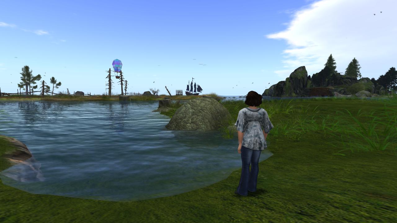
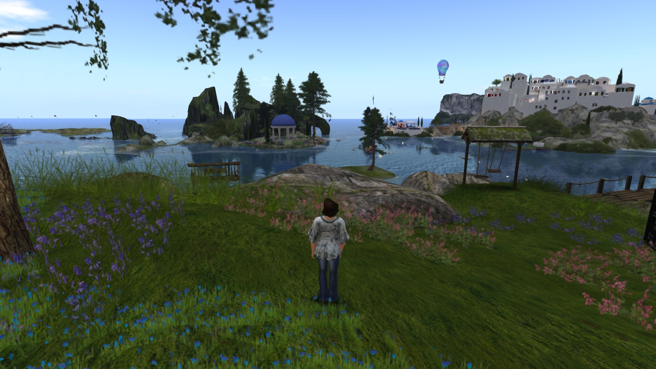
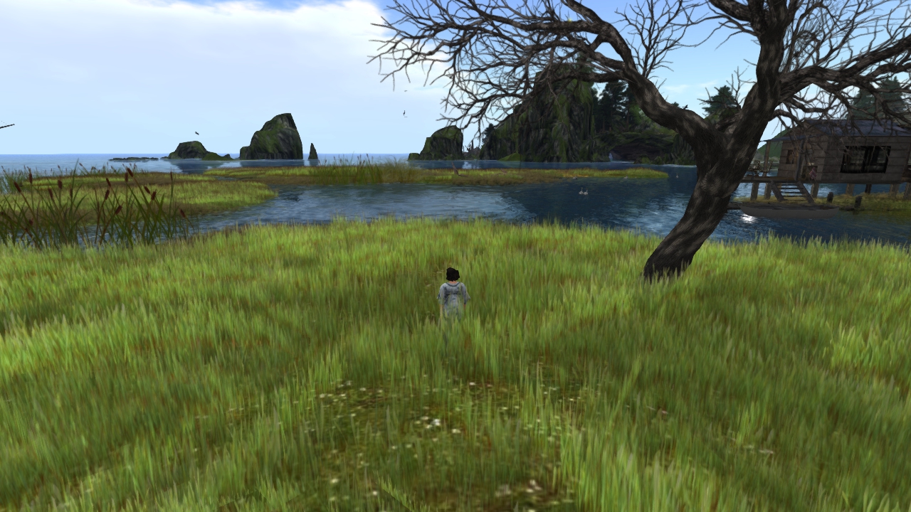
For my test I decided to fly off to the Calas Galadhon park sims, among my favorite places in SL. I took a pic with the regular client for comparison, then logged out and switched over to SL Go. (Click for full res on all of the pics.)
The first thing I noticed when I logged in with SL Go is it runs at 1280×720, and that looks weird and a little blurry and awful when I’ve been used to running 1920×1080 for the past few years. It made the UI absolutely huge, and the whole screen had this soft look to it, kind of like when you artificially enlarge a jpg. There was some oddness with the mouse as well, the sensitivity was way off and it made selecting things on the menu a little tricky a couple of times.
Of course I set the graphics to ultra and maxed everything immediately, and the rendering was quite nice. Everything rezzed quickly, but the graphics seemed to blur now and then when I moved around, particularly on the UI. Moving around was really smooth, I didn’t look at the FPS but I’m sure it was buzzing along at a good rate and I didn’t notice any hesitation when I flew over sim borders. That’s definitely a nice thing to experience, while my laptop will run SL on ultra and look wonderful my fps is never out of the teens. I envy the machines OnLive has at their disposal.
Since most of my time in SL is spent looking for things to take pics of I wished I could have spent more time poking around to see what sort of photos I could come up with. I saw that the checkbox for depth of field was there but I didn’t try it, I don’t know if it’s possible to make adjustments to that or to modify windlights on the fly, rather than just using the ones provided in the default viewer. Unfortunately a twenty minute trial doesn’t give you enough time to experiment and learn what you can and can’t do, and the time I had was ticking down so I decided to log out of the desktop and test it on the Nexus.
Logging in on the Nexus was easy, and the 1280 x 720 resolution looked a lot better on a small screen than it did on a 24″ monitor. Tablets seem to be where this service will shine, and I really wish I had a full size tablet to test it on because a 7″ screen is pretty tiny for something as detailed as Second Life. The onscreen hud movement and cam controls were easy to learn but extremely sensitive and I ended up revolving around and staring up into the clouds most of the time, but I was able to get the hang of them and fly around a bit. More time would have been a lot better, though, twenty minutes (or, more accurately, nine minutes for me) isn’t nearly enough time to feel comfortable with all the controls. As I was setting it up to email myself photos I found that the keyboard covered up most of the view, chatting on a small tablet might be a little frustrating if you don’t have a bluetooth keyboard.
There is a timer on the side of the screen that shows how many minutes remain, and if you don’t purchase additional credits before your time expires you are logged out automatically, so there’s no fear of being billed for hours you didn’t want to buy.
Trying this was definitely worthwhile, but given my own personal usage patterns I can’t imagine paying $3.00 per hour to try to learn to use it (that drops to $2.50 per hour if you buy 10 hours, but still…) I had higher hopes for the desktop client, if I could run it at 1080p instead of 720 I might have considered handing over some money to buy a few hours of time and wander around relatively lag free. I like the mobile version, it does look very nice and I love the idea of tablet access, but I personally can’t forsee a need to log in via mobile client. And, again, the current price plan scares me off.
Ultimately, while I really don’t have the discretionary income to justify paying extra for a service like this, I think SL Go has a lot of potential and I hope they succeed (and consider some different pricing plans.) If they’d offered a much longer free trial period, I’m thinking something more like 6 hours rather than 20 minutes, I might have fiddled around with it long enough to get hooked. Alas, twenty minutes was only long enough for me to get frustrated and decide that while it looks nice, it’s just not for me.
I suppose my further travels in SL will have to wait for my laptop to come home. *Sigh*


 RSS - Posts
0 Comments